Atlantis Transportation Hub
Personas
Concept Sketches
User Flows
Black & White Mockup
Color Mockup 1
Color Mockup 2
Final Mockup & Animation
05-392 Interaction Design Overview
Fourth Year | Spring 2019
Professor: Rita Lee, Shelley Moertel
Duration: 2 week project
INTRODUCTION PROMPT (PROVIDED)
You will need to design an interactive, data-driven display that structures and presents the data in an engaging, appealing manner and meets the needs of your stakeholder and users.
We will provide you with:
A set of data about a fictional transport hub called the “Atlantis Transportation Hub” for the San Juan Islands (a real set of islands), which are located off of the coast of Washington State. The data includes information about planes, trains, and ferries.
Personas of one stakeholder and two users, with accompanying use cases.
Details
- The hub is located in the San Juan Islands on the main island of San Juan.
- The display is only for this hub.
- The display is a data-driven interactive touchscreen, i.e., you cannot use a smartphone to interact with the screen.
- Apply asic tenets of type, color, composition, grid, information hierarchy, interactions, etc., to apply to your design.
- The display will require the use of simple animations for interactive elements and to signal data changes.
- Consider adding additional information and visual elements to enhance the experience.
Personas
Provided as part of the prompt for the project.

Elizabeth Duarte
Transportation Director fo the Municipality of San Juan Islands
Elizabeth Duarte is the Transportation Director of the Municipality of the Greater San Juan Islands, a division of the local government that operates Atlantis Hub. Her department is responsible for displaying transportation data on large environmental displays in the Hub for Atlantis customers. In addition to offering highly readable displays of changing transportation data, Elizabeth aims to educate the public about the ease with which travelers can make itineraries by combining plane, train, and ferry trips through her new program, the PTF Pass, which allows customers a great value and a lot of flexibility.

George Shimko
Property owner and retired resident of San Juan Islands
A long-time resident of the San Juan Islands, George Shimko is an avid outdoorsman who owns modest fishing cabins on nearby Orcas Island and Stuart Island. He regularly invites his children and grandchildren to his house on San Juan Island and intends to give them PTF passes so that they can travel throughout the San Juan Islands and to his cabins on Orcas Island and Stuart Island. He wants to be able to use his home on San Juan Island as a base so his guests can plan fun tourist itineraries.

Patrick Mulvaney
EnCo Environmental Engineer
Patrick Mulvaney, is an environmental engineer for EnCo, a large energy company in the region. As an engineer for EnCo who is stationed in Seattle, Patrick spends an average of three days per week visiting drilling and wind power sites throughout the San Juan Islands. Because weather often influences his travel between the islands, Patrick welcomes the new PTF Pass program that allows him to plan multiple trips via planes, trains, and/or ferries so that he can optimize his travel on-the-fly despite changing weather conditions.
Concept Sketches
For my first concept sketches, I investigated different approaches to how to display the complex information provided in the data.
Each approach organizes the information by 1-2 methods from Richard Saul Wurman’s “Five Hat Racks.”
- Location
- Alphabetical
- Time
- Category
- Hierarchy
Though each of the three concepts was able to organize the current data information, they did not address the PTF pass and did not allow a user to create an itinerary to travel through the islands.
The third option, which includes a larger map design, has the most potential to become a more complex interface, which would have to include information about the PTF pass and an itinerary scheduler.
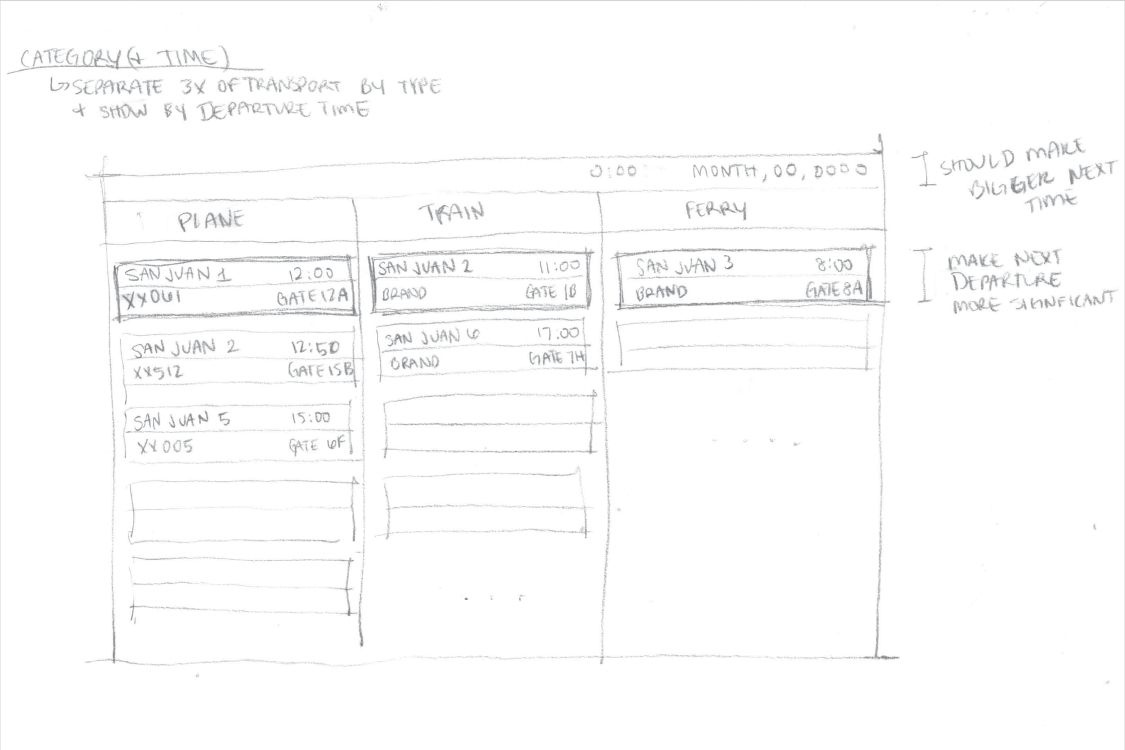
Scheme 1
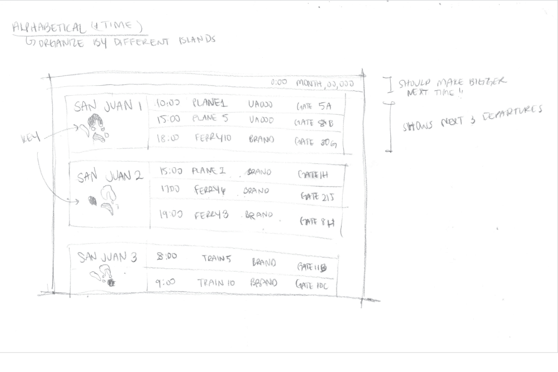
Scheme 2
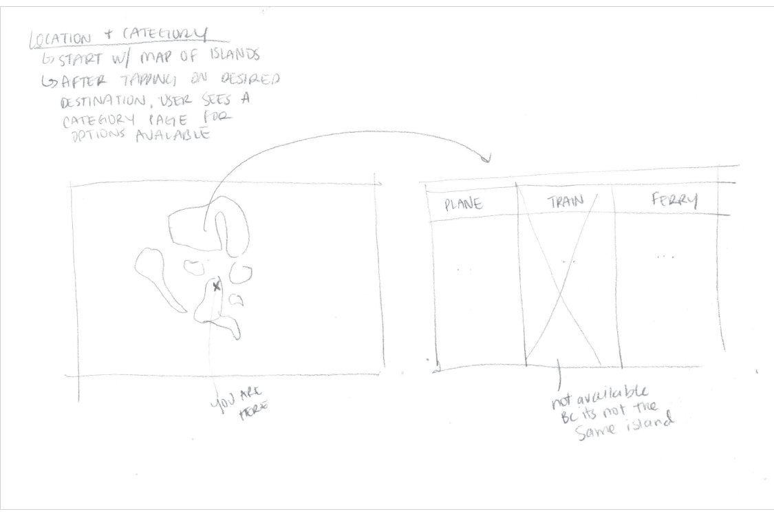
Scheme 3
User Flows
User Flows (InVision FreeHand) here.
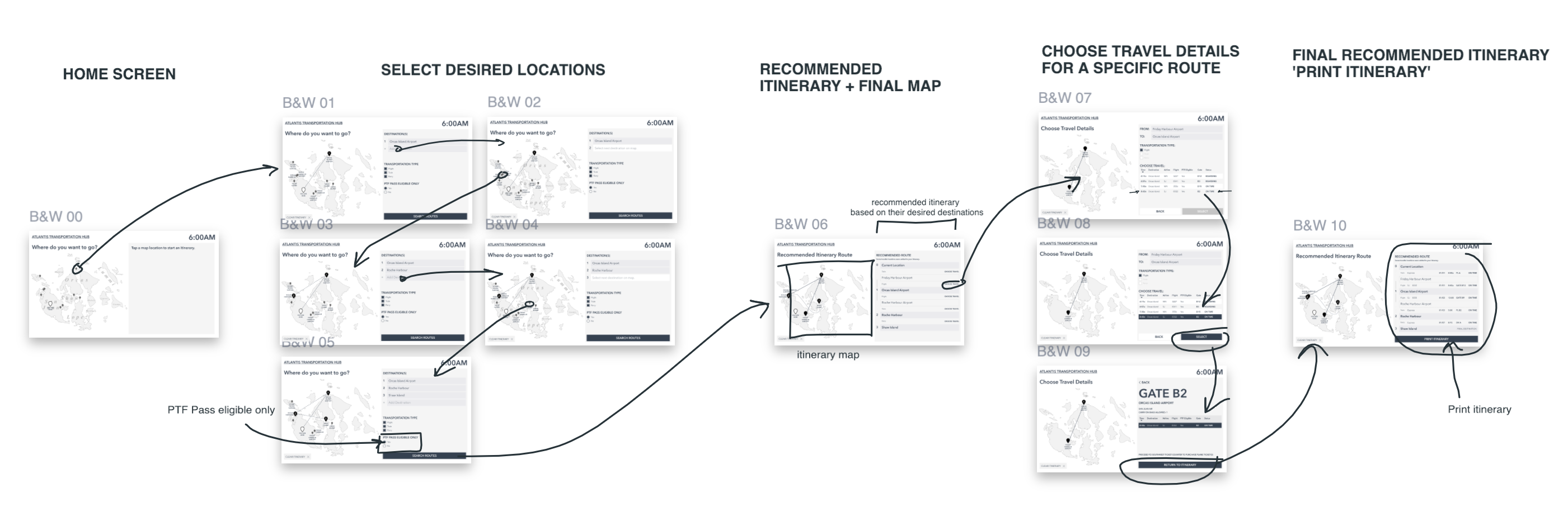
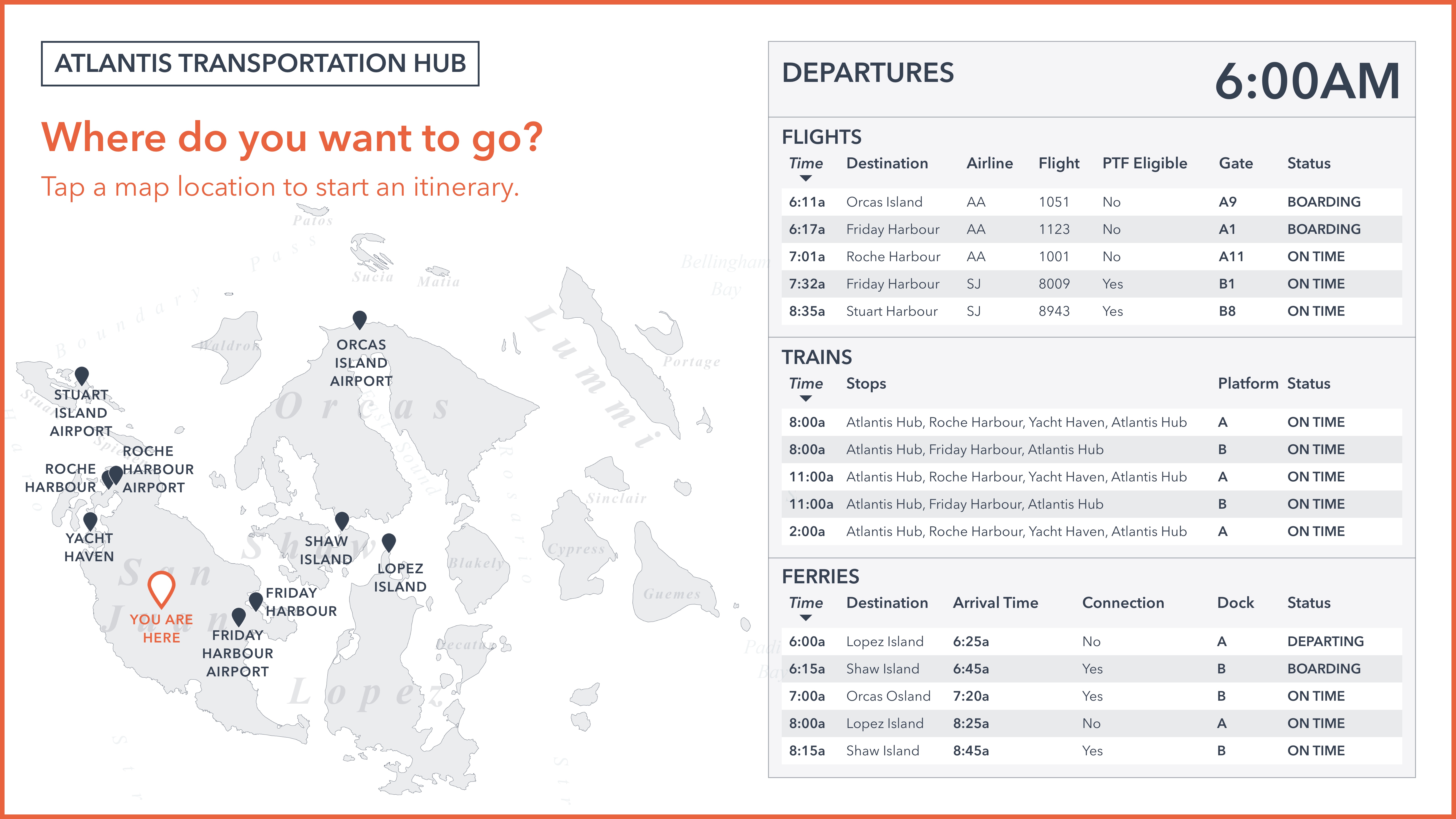
Black & White Mockup
In the first digital black & white mockup, I focused on creating an experience for users to create an itinerary to travel through the San Juan Islands. This included:
- a map with marked locations as a way for the user to navigate the transportation hubs around the islands
- a recommended route calculator (based on the desired destinations) with automatic transfer locations
- options for travel types and details
- detailed information about each travel option
- print your itinerary
Sketch Screens here.
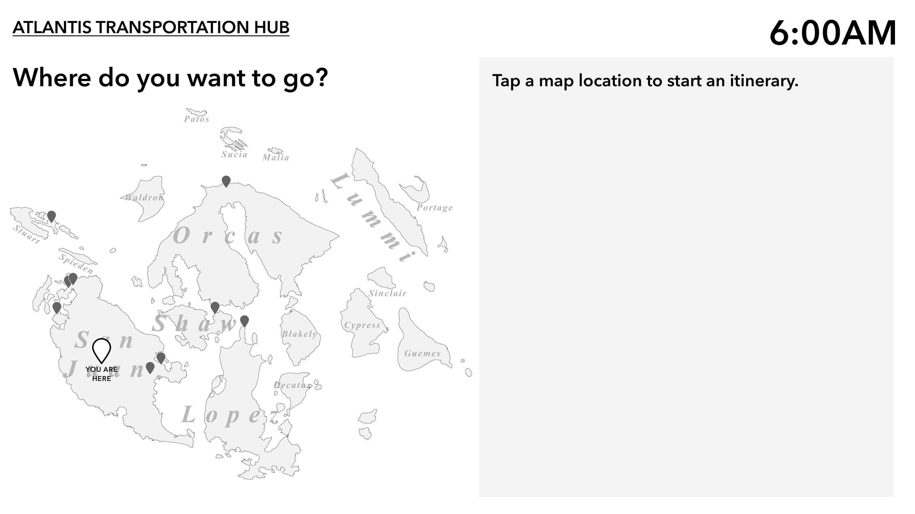
Home Page
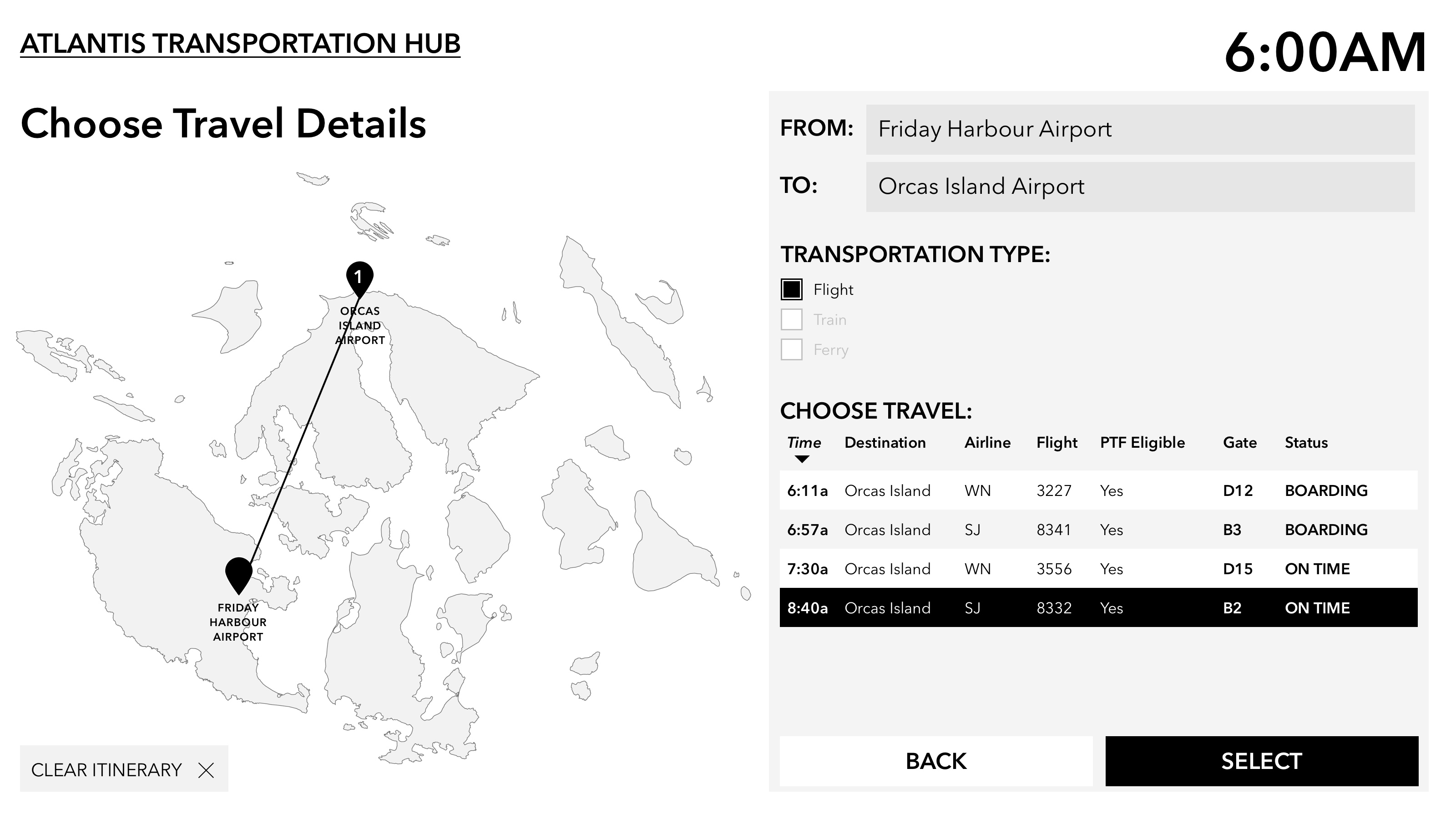
Choose Travel Details (from available options)
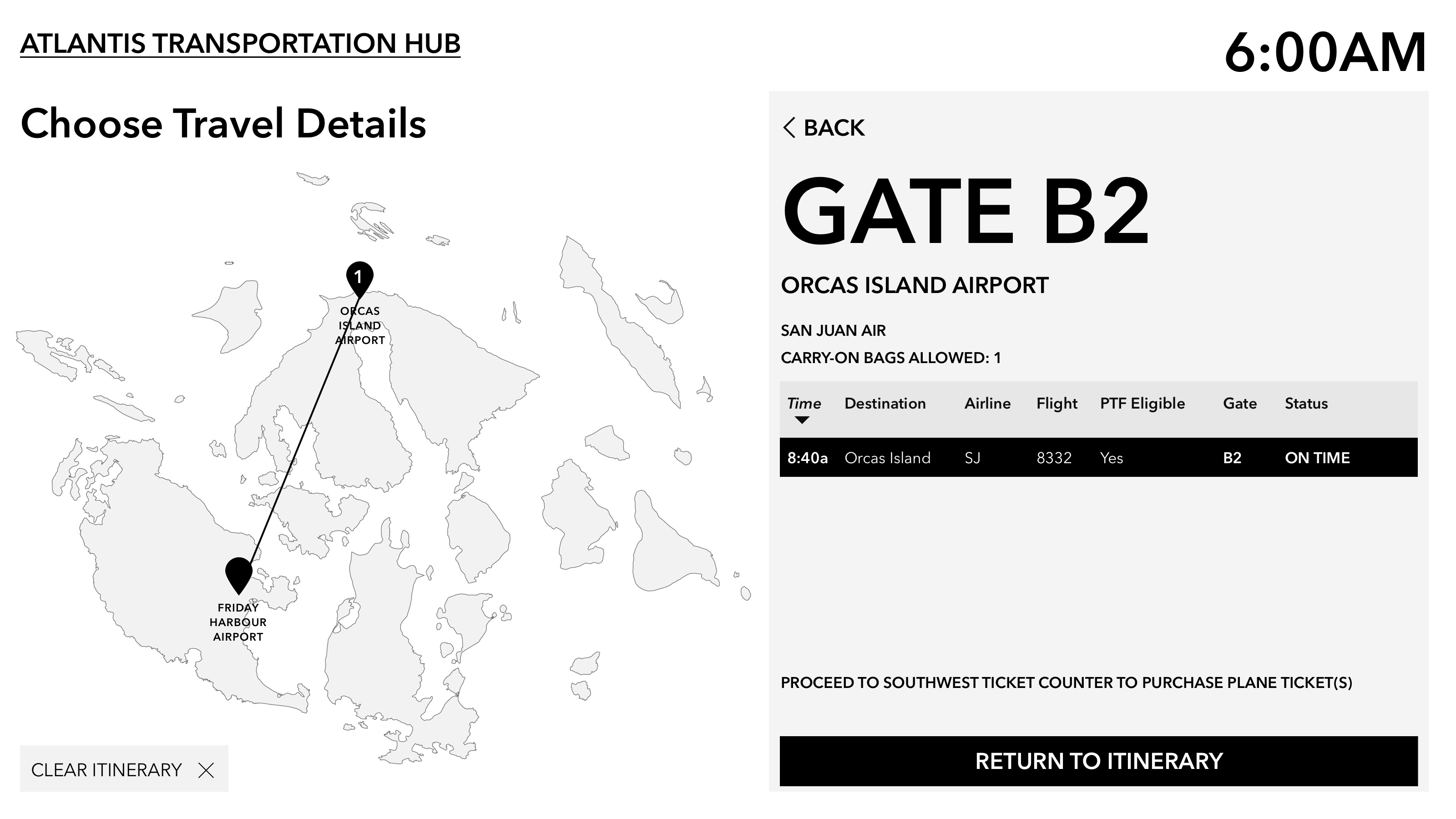
Gate Information
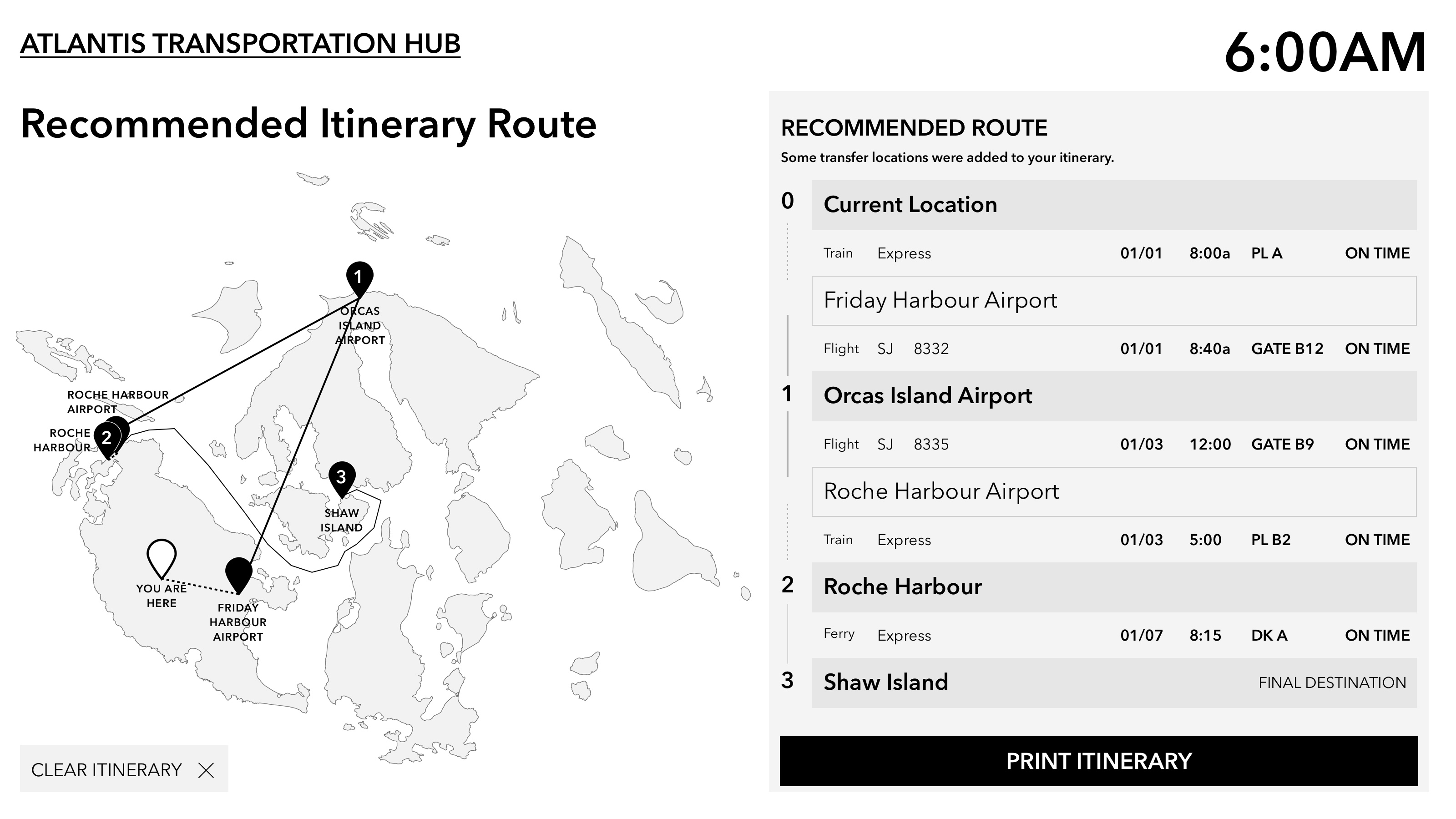
Recommended Itinerary Route (with completed travel details)
Color Mockup 1
Introducing color into the mockup allowed for a greater variety of hierarchy, in addition to type hierarchy and opacity. I chose a Burnt Orange as the accent color, paired with a deep navy blue and a light blue-grey wash.
The Burnt Orange accent color was used because it invokes high energy or excitement, foreshadowing the exciting trip ahead of them. The accent color highlights the current task at hand, such as “Where do you want to go?” as well as the main call to action buttons or links on the page.
Sketch Prototype here.
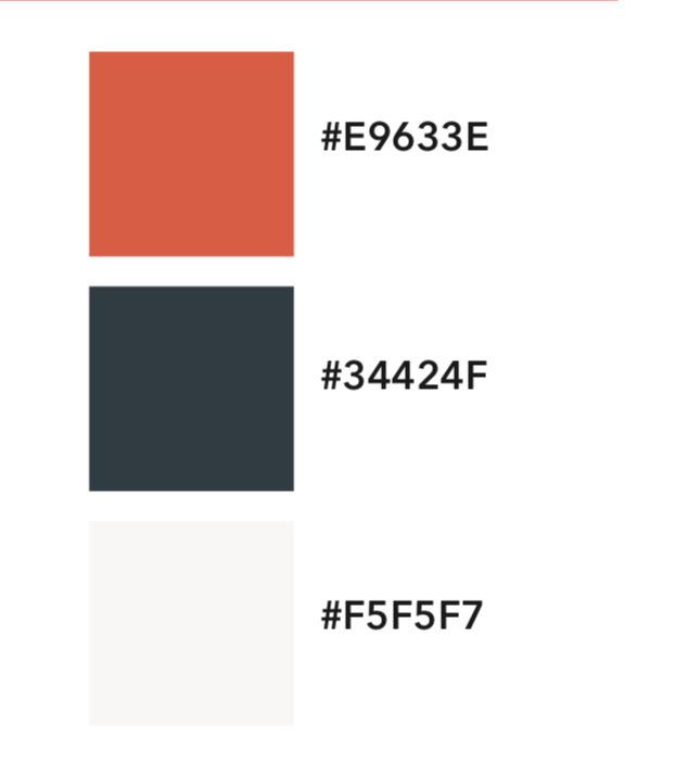
Color Palette

Home
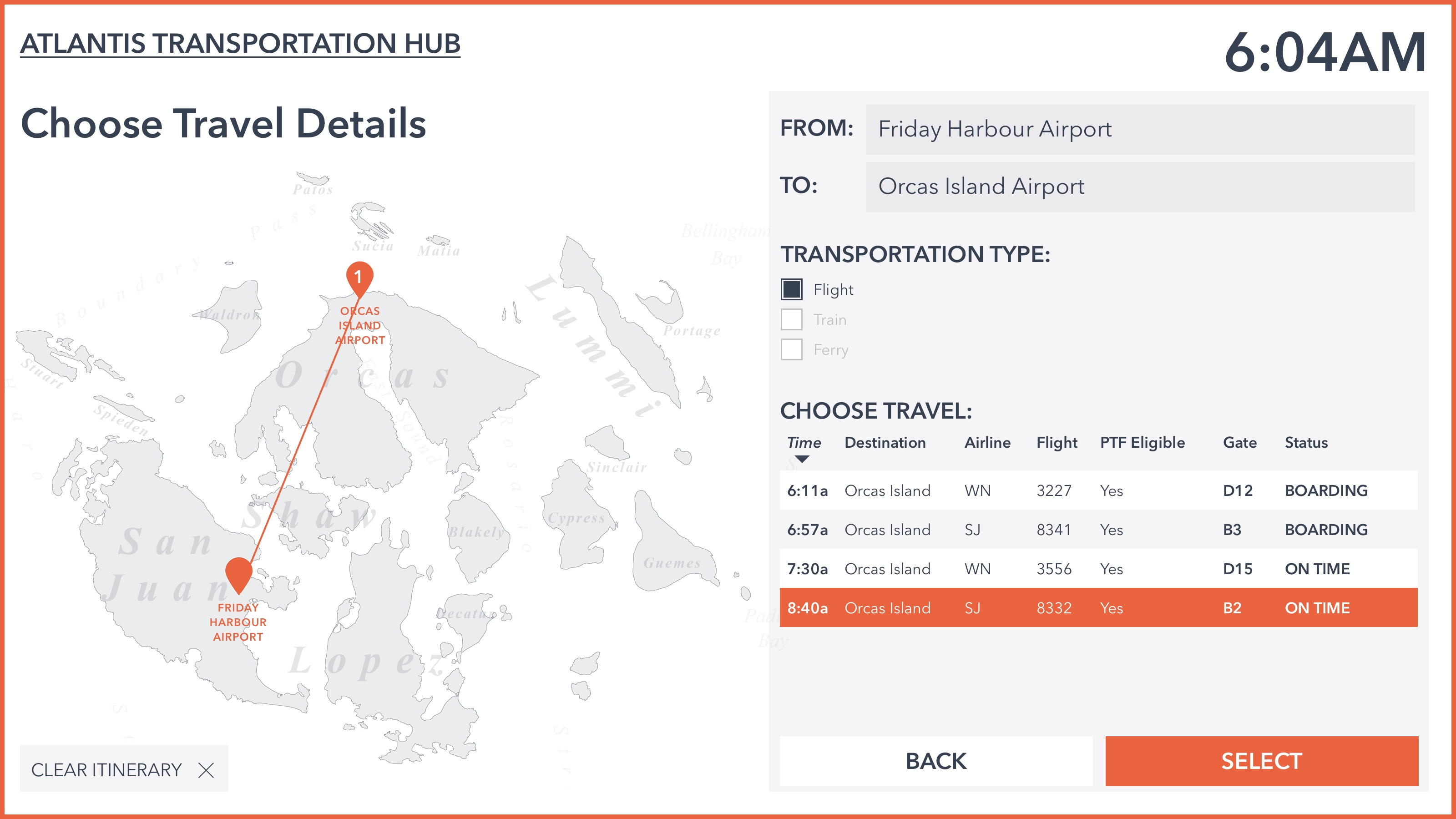
Choose Travel Details (choose one option)
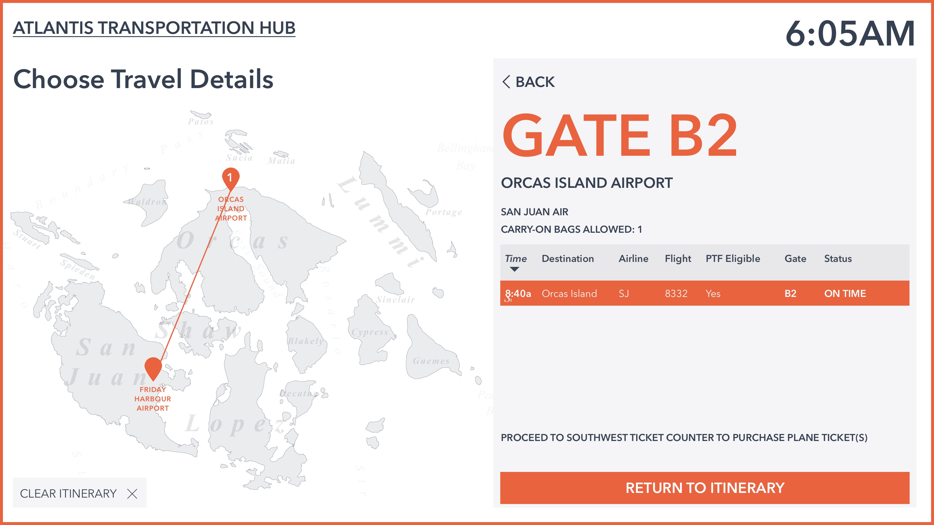
Gate Information
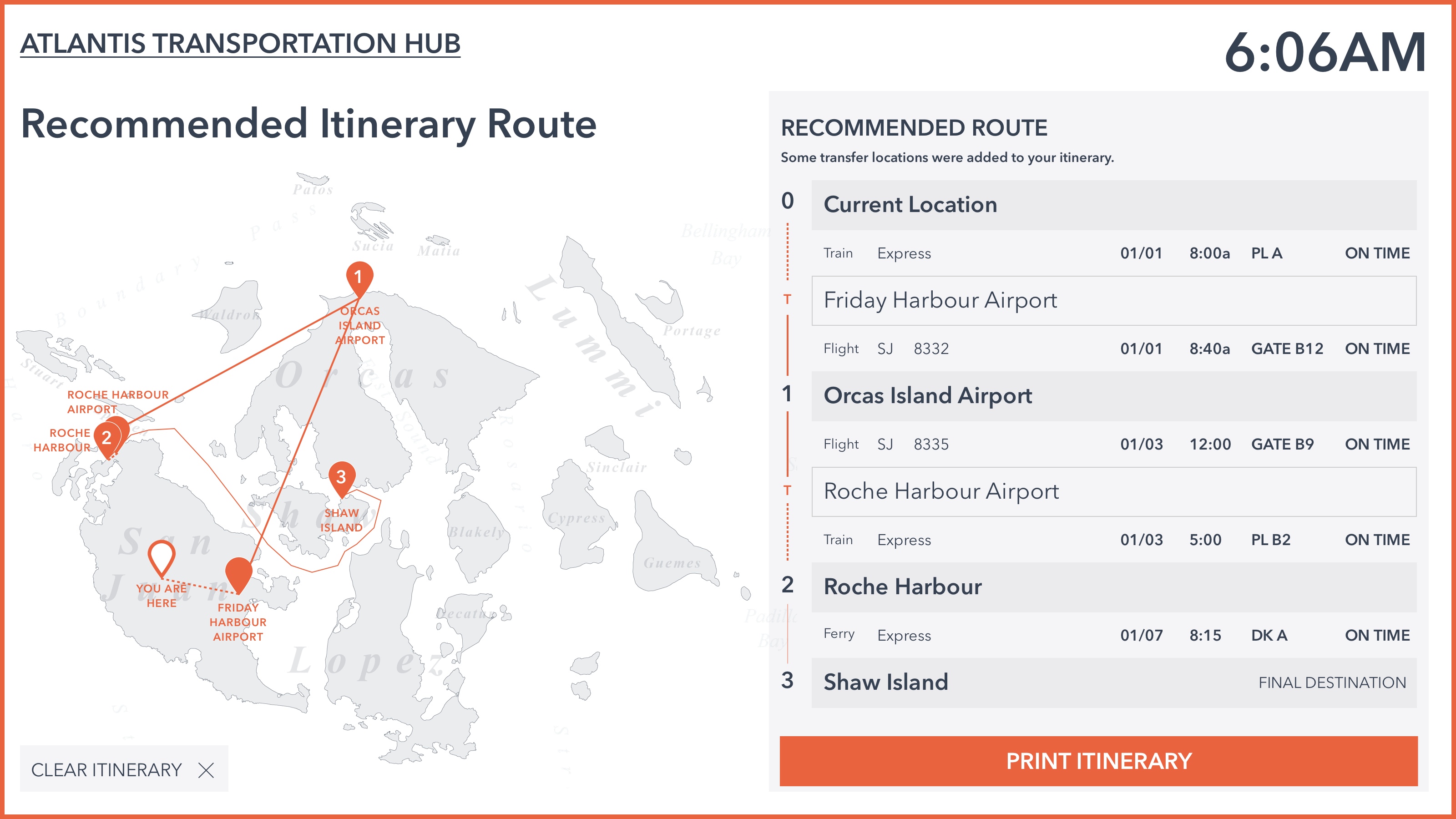
Recommended Itinerary Route (with completed travel details)
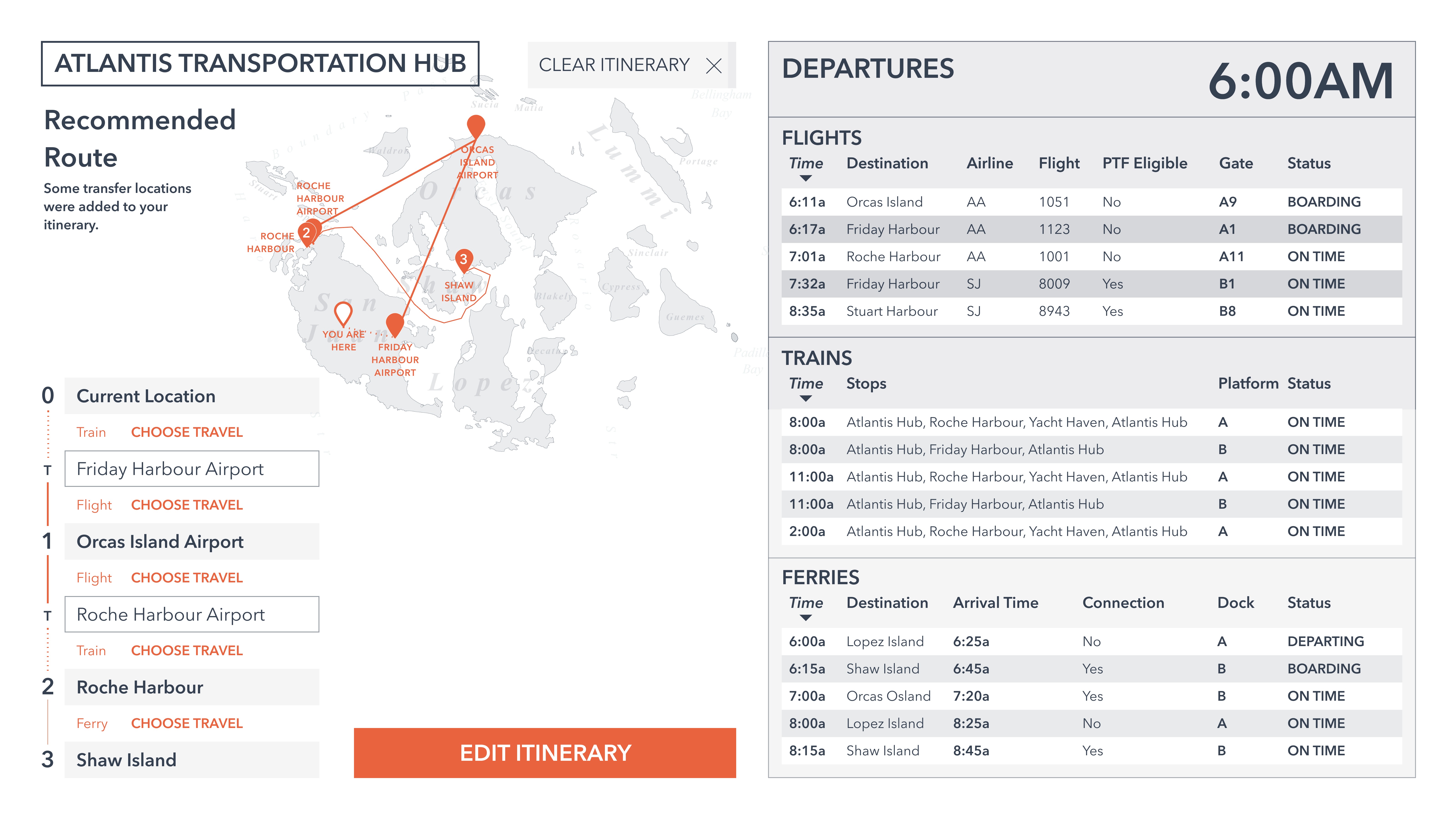
Color Mockup 2
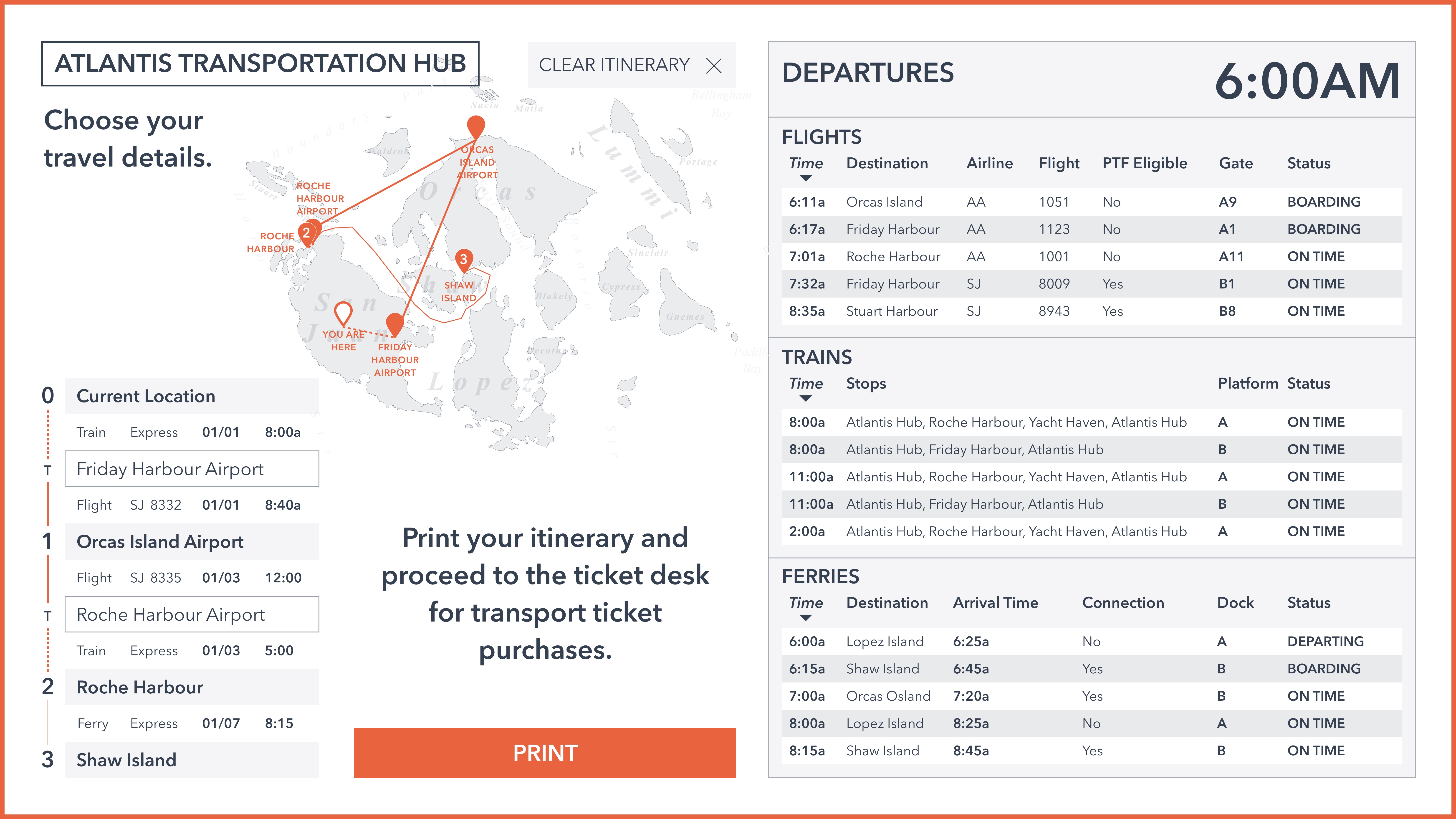
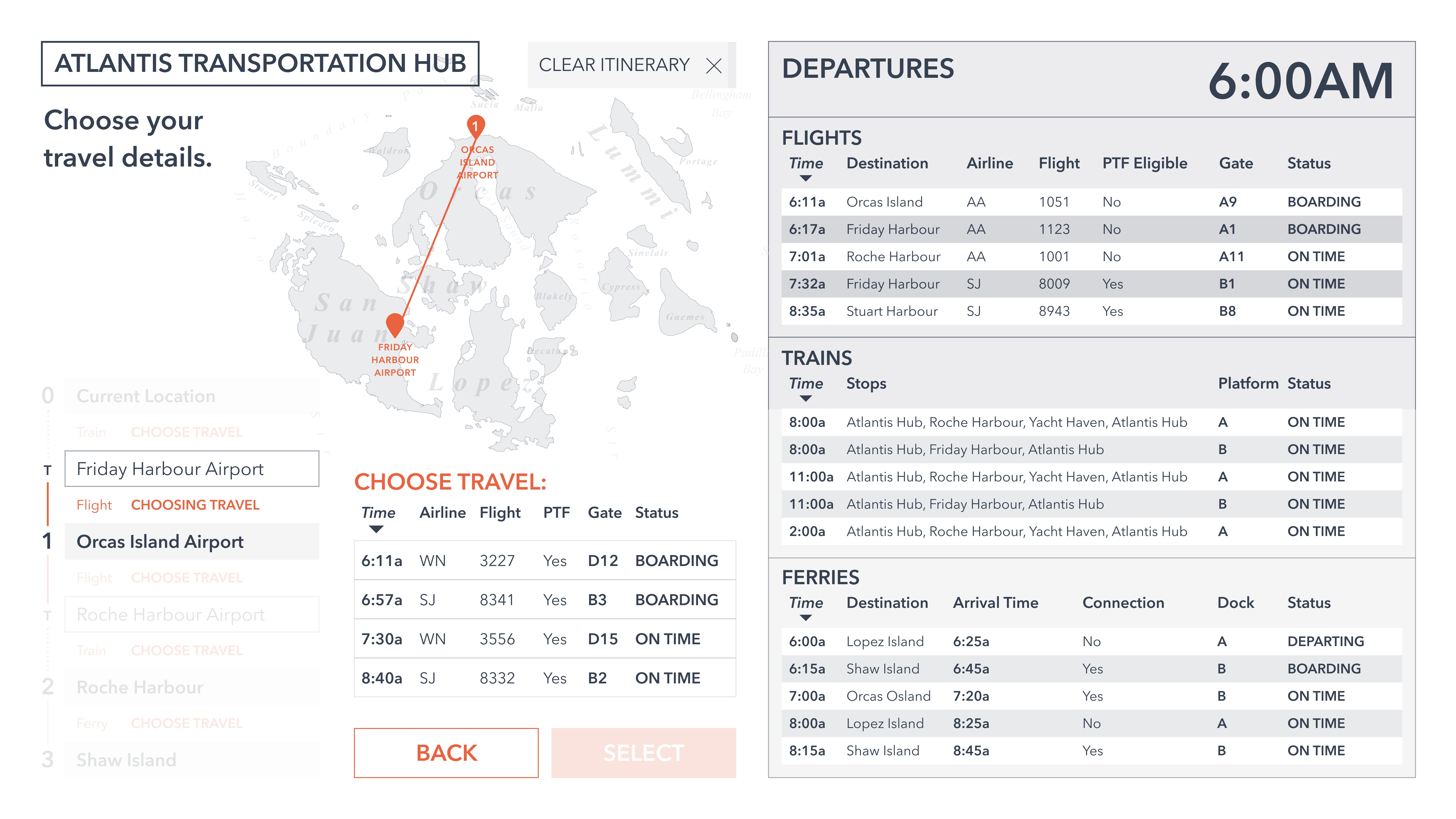
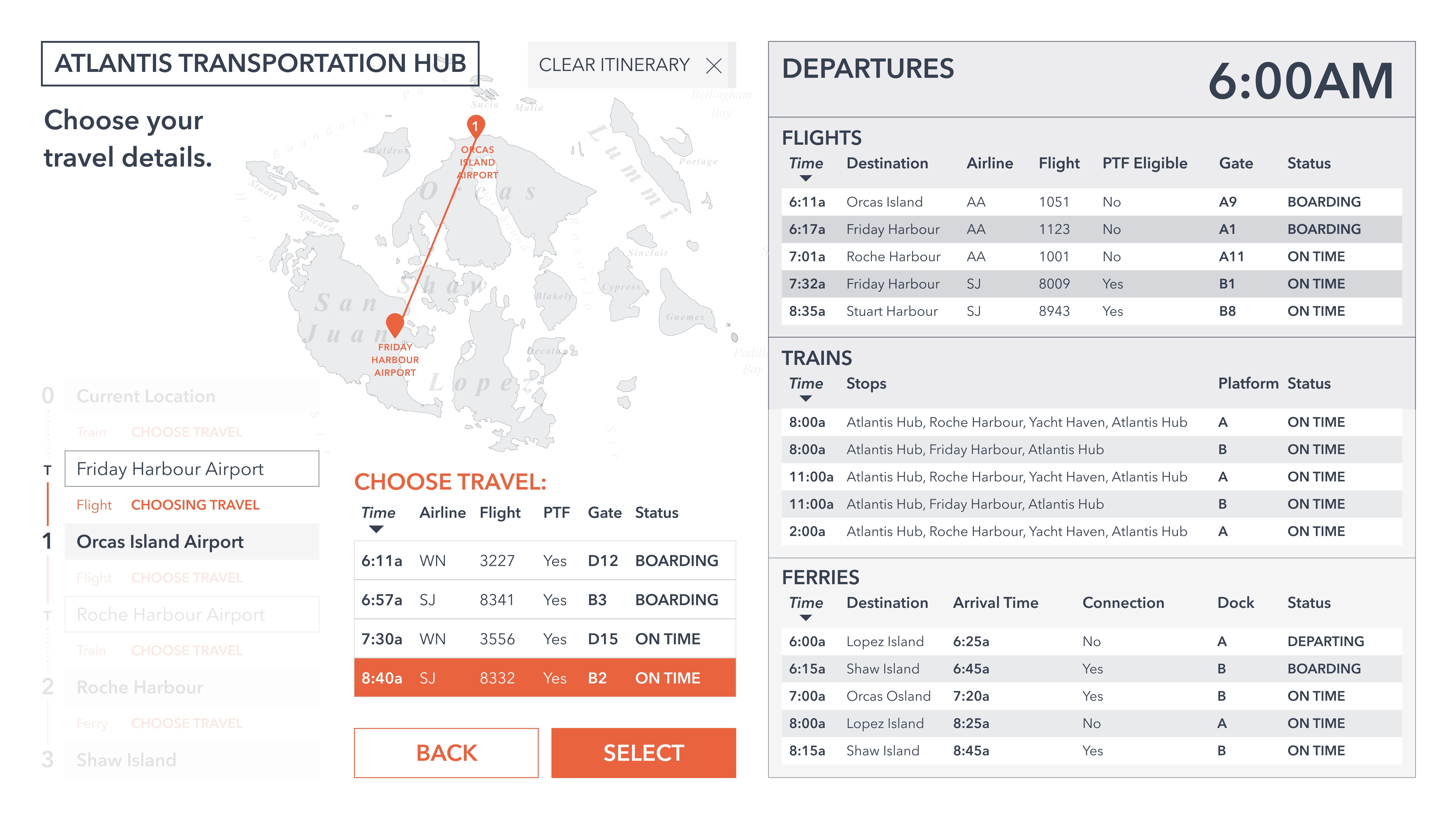
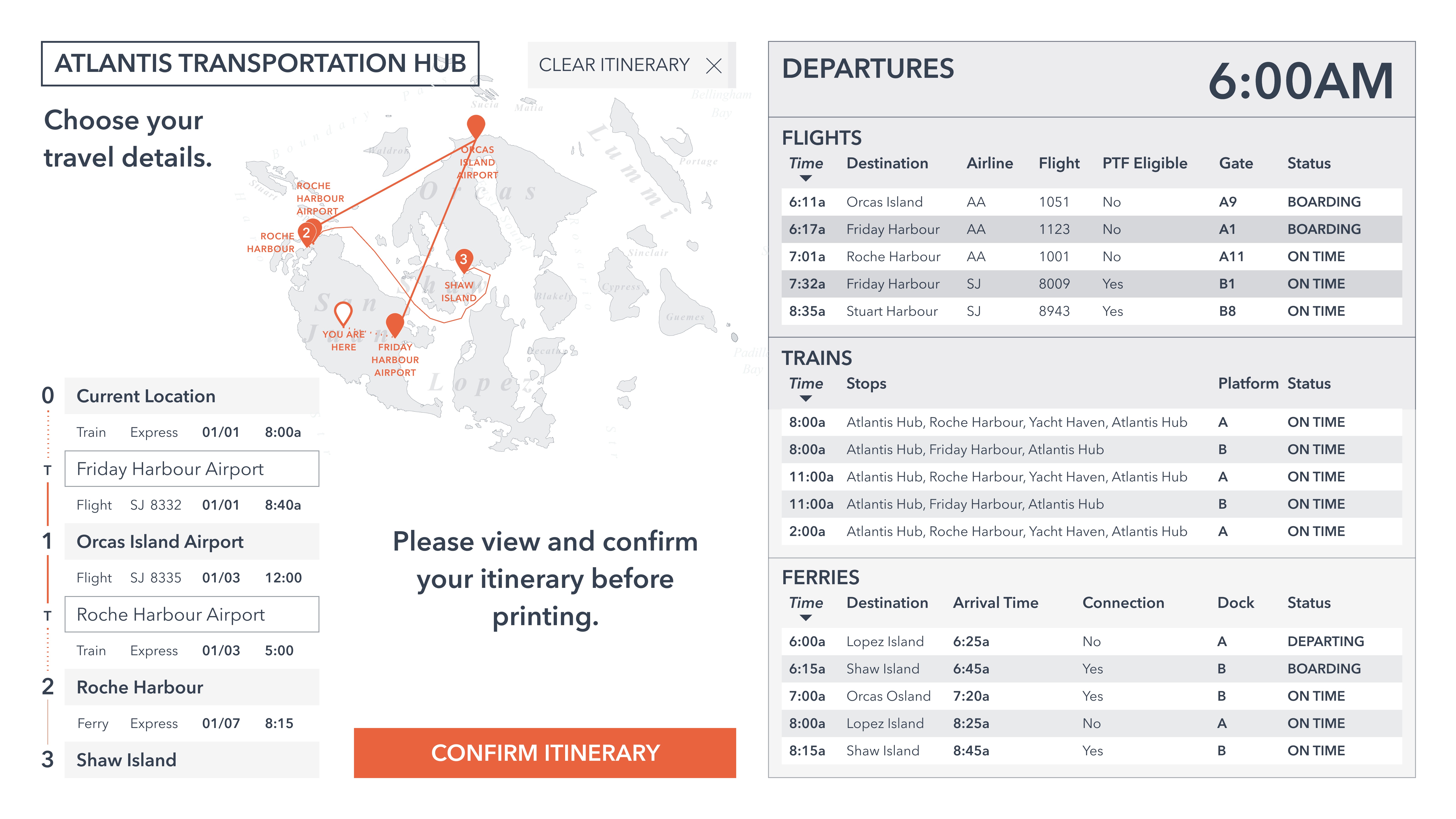
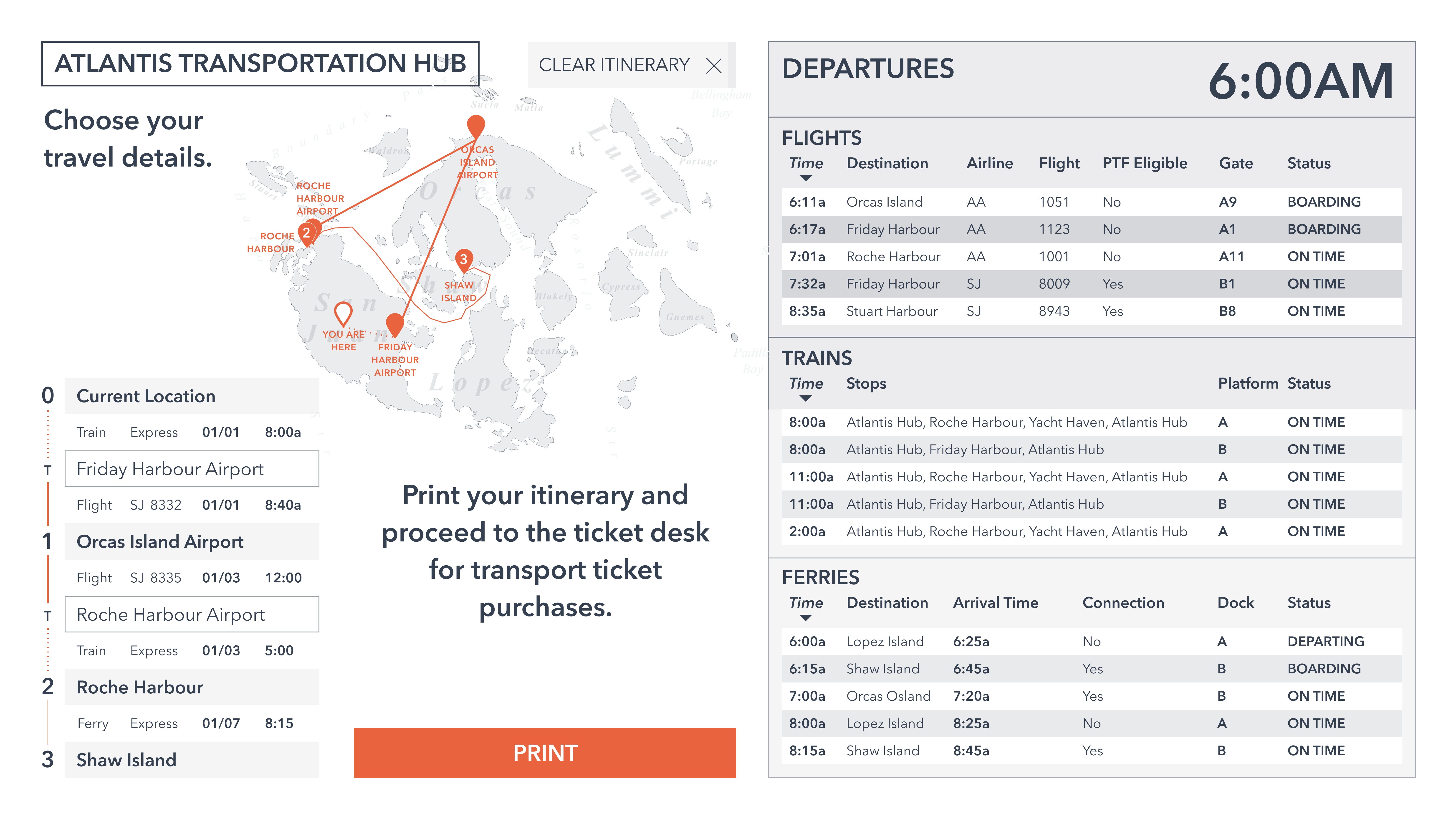
The second color mockup integrated the terminal data information provided in the prompt into the current design, by moving the itinerary scheduler to the left half of the screen, and placing the current information about flights on the right. This allowed multiple users to interact with the display; they could view the current transportation information at a glance while another user could user the itinerary scheduler.
Because the itinerary scheduler was now given less screen real estate, a lot of thought was given to only displaying important information in the “Recommended Route” page, which gives users a step-by-step travel itinerary, along with transfer stops. The map decreased in size in order to allow sufficient space for “Choose Travel Options,” and to read instructions.
The Burnt Orange accent color continued to highlight important call to actions or links that the user should utilize.
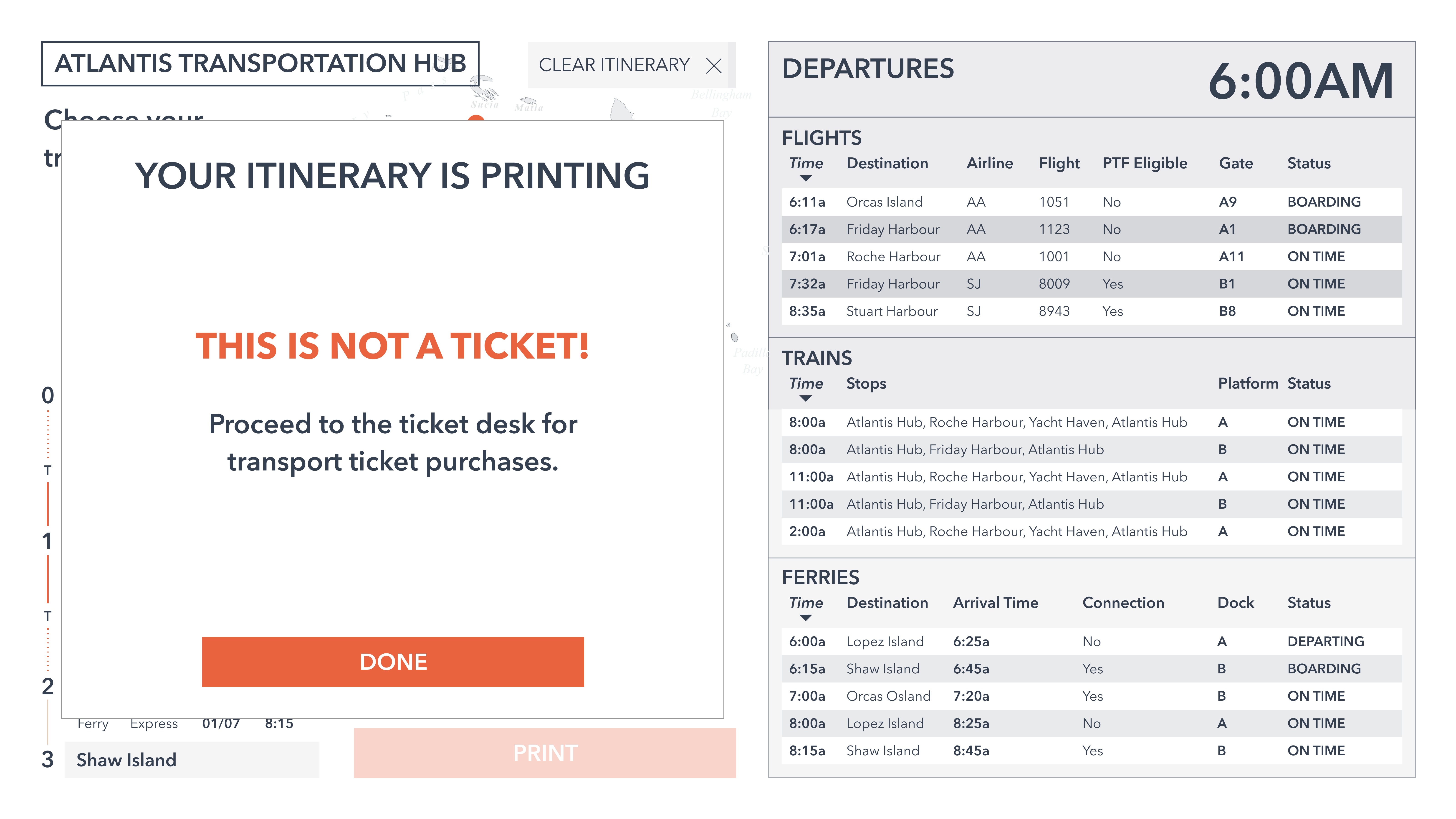
This mockup also provides more of an experience to printing ones’ itinerary, by instructing them to attend to the ticket desk for actual purchase of the transportation tickets, as the itinerary printout is not a ticket itself.
Sketch Prototype here.
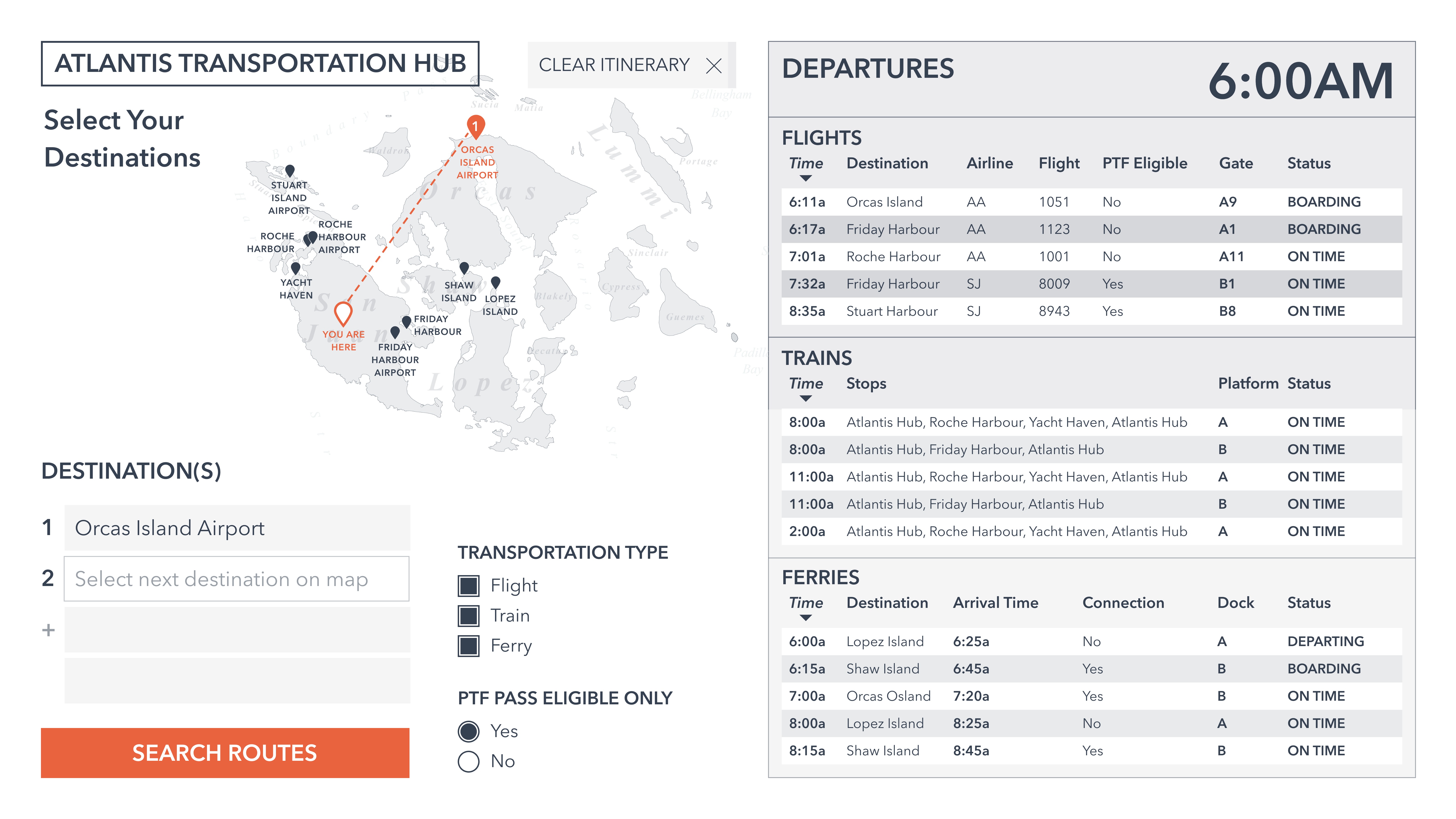
Home
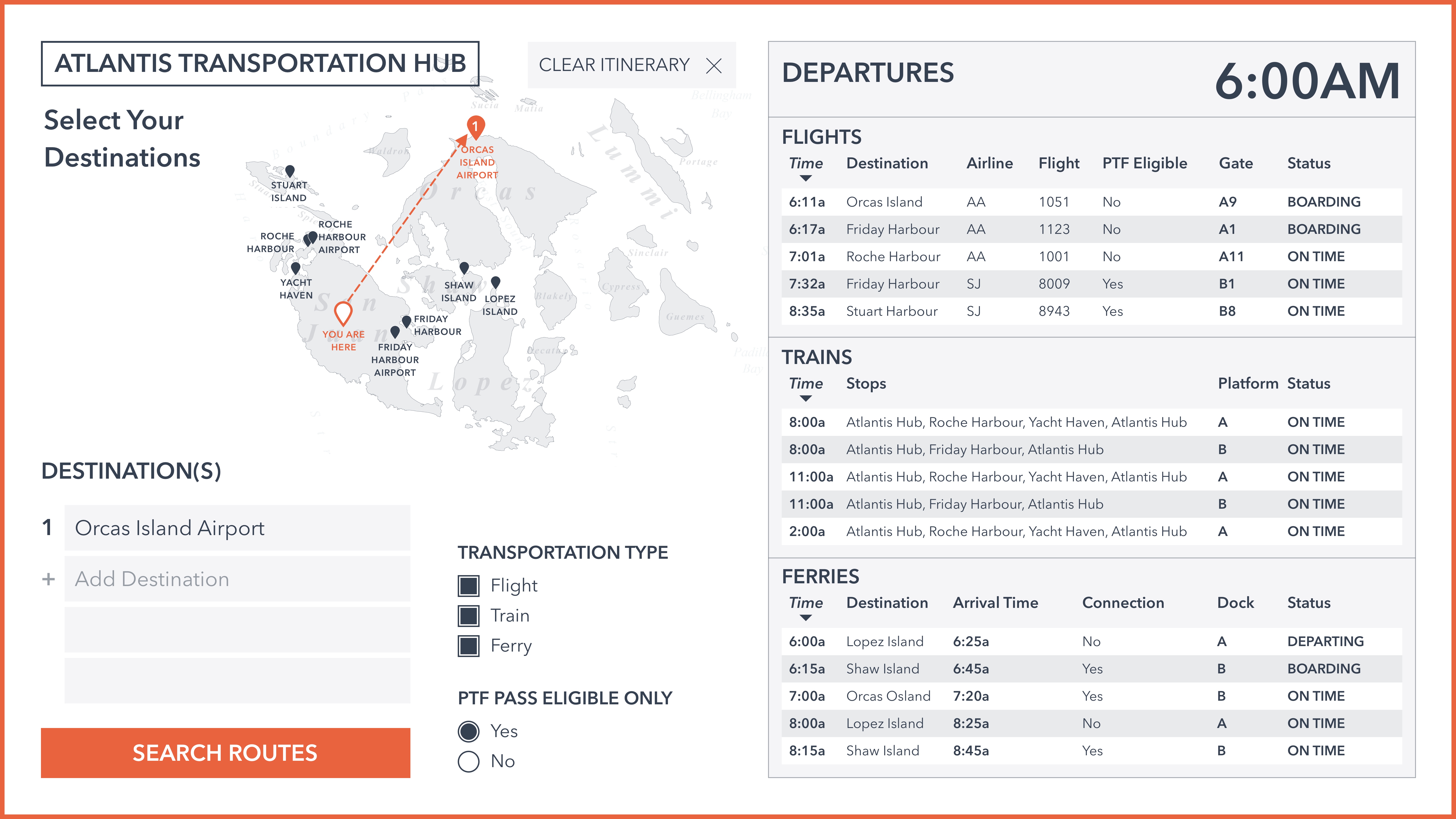
Select Destinations 1
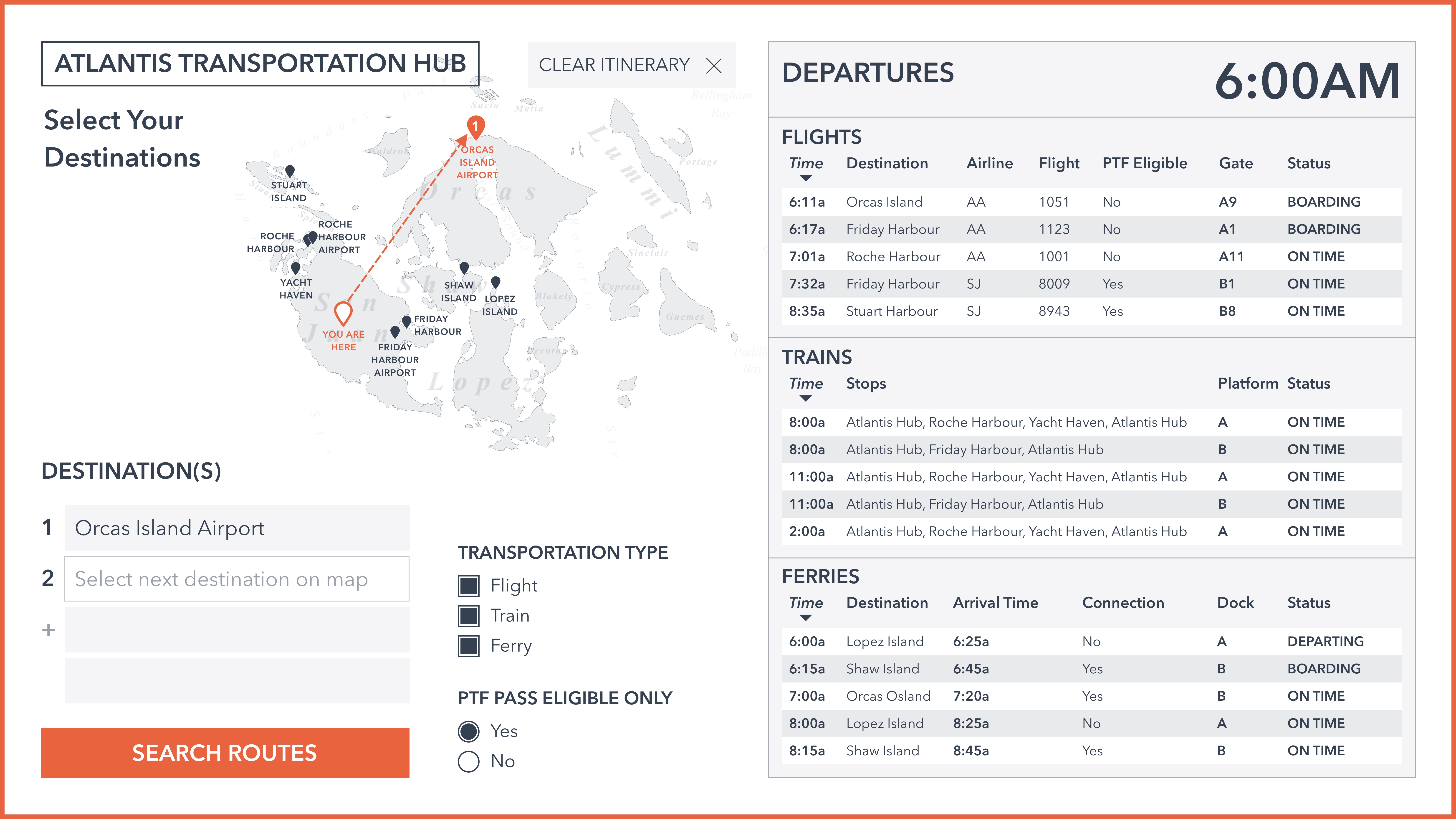
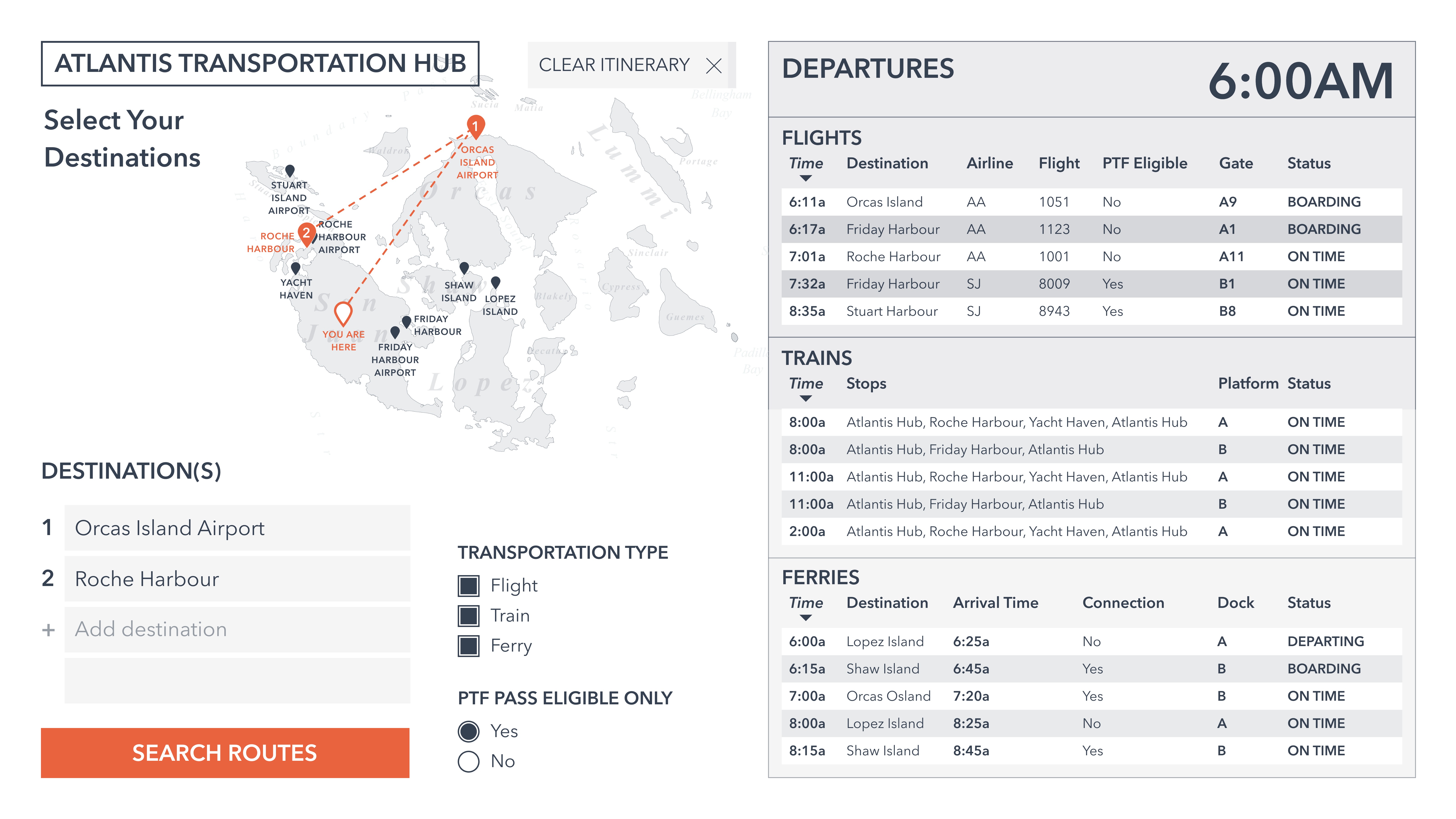
Select Destinations 2
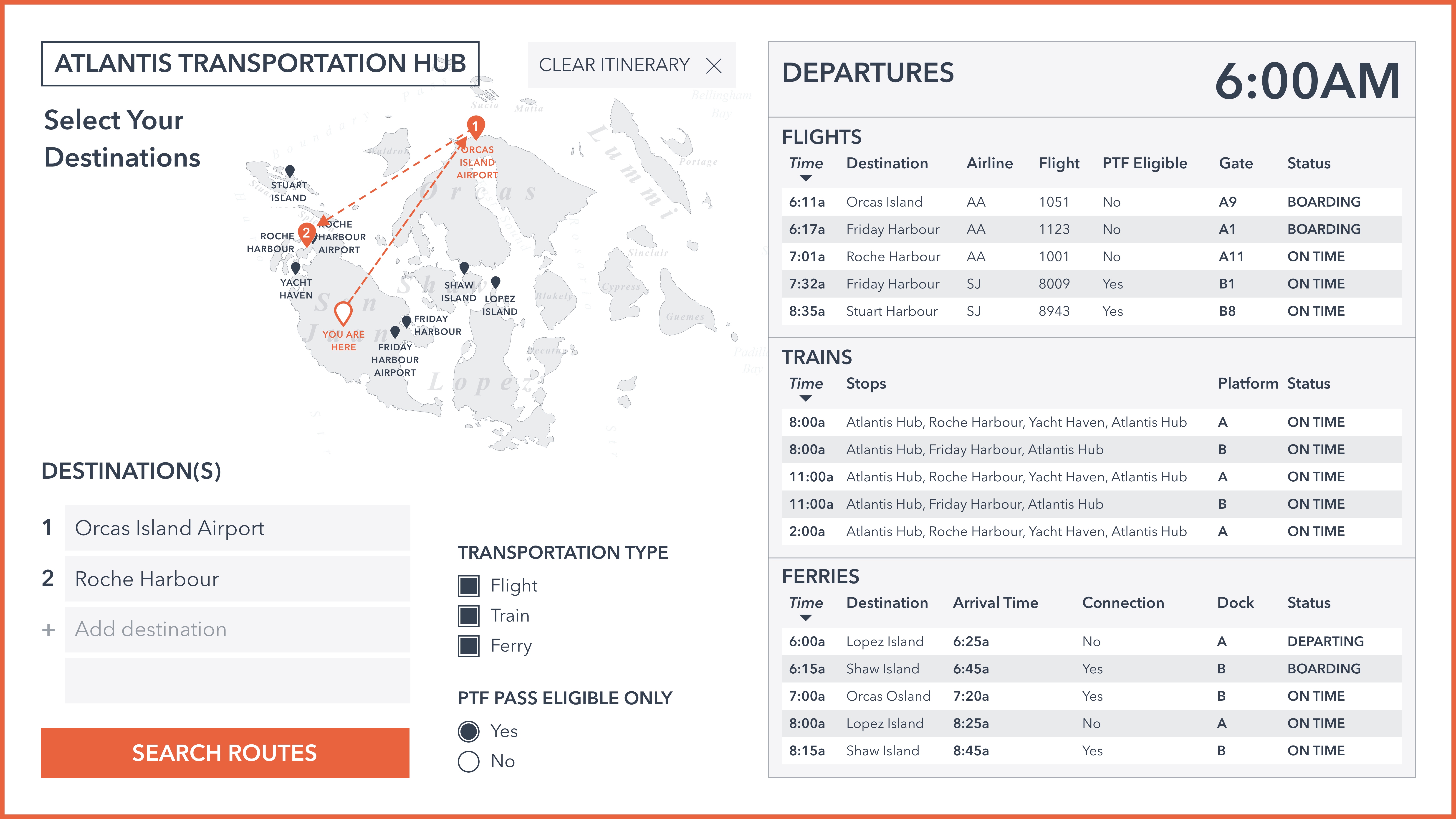
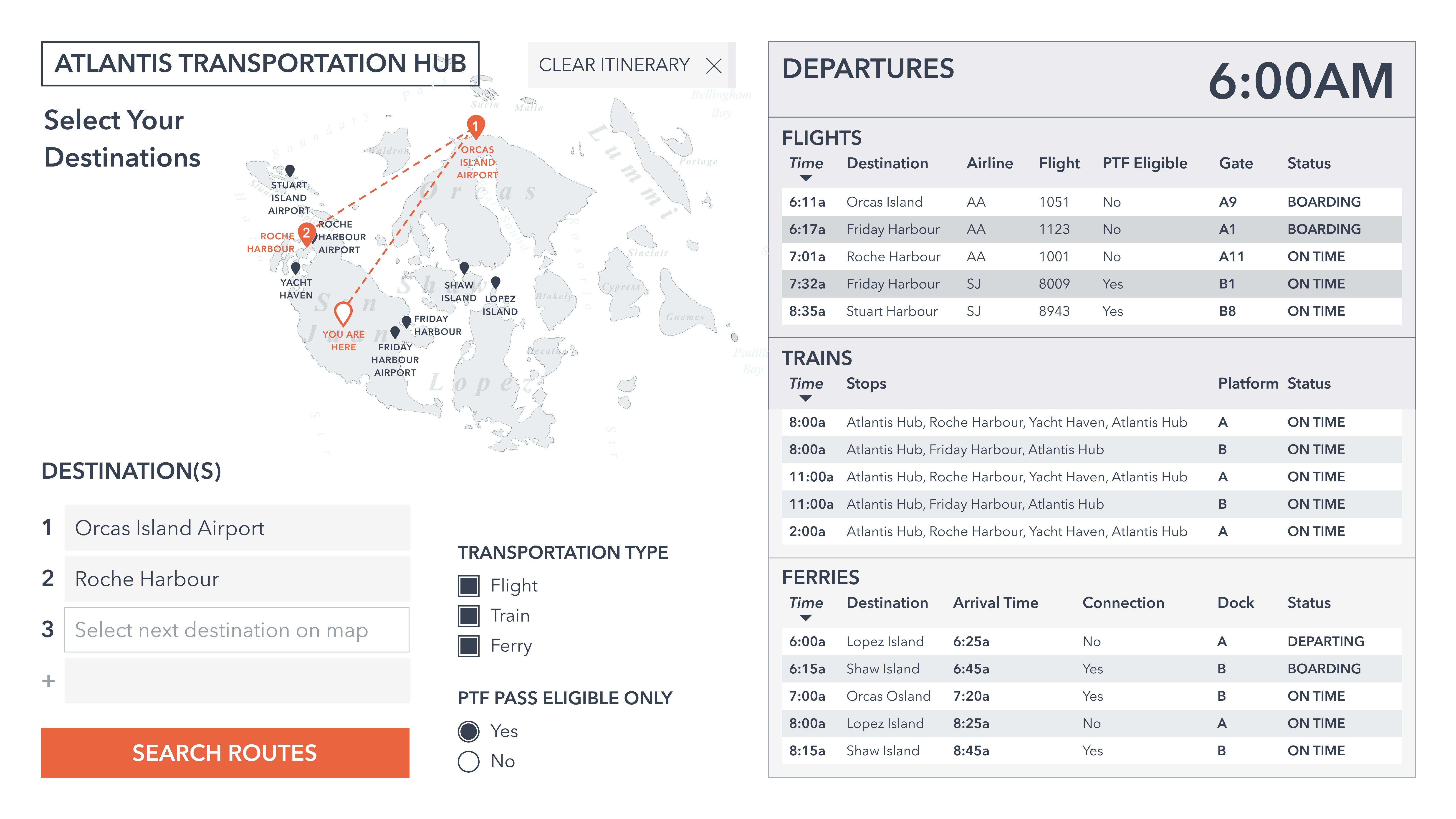
Select Destinations 3
Select Destinations 4
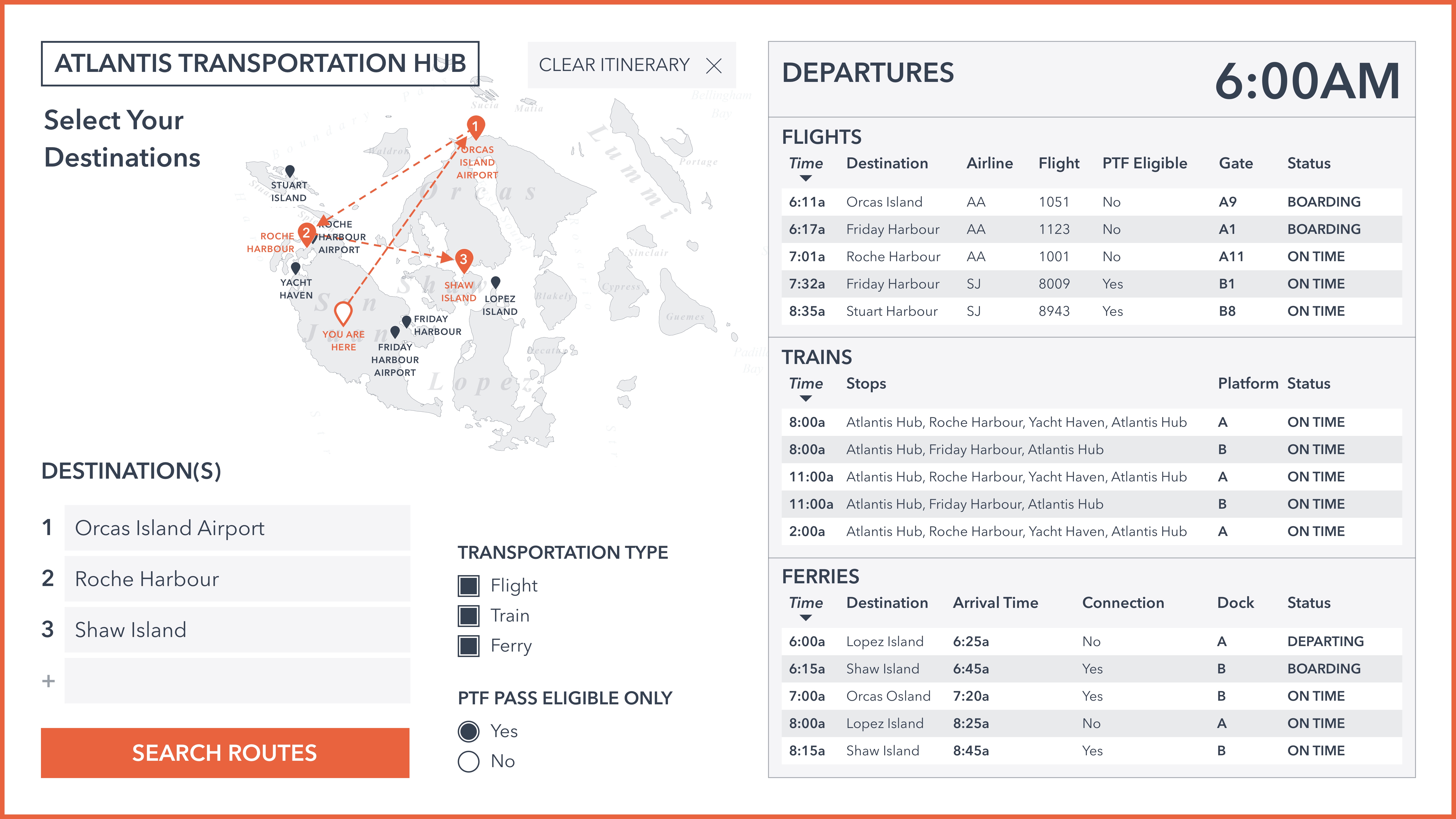
Select Destinations 5
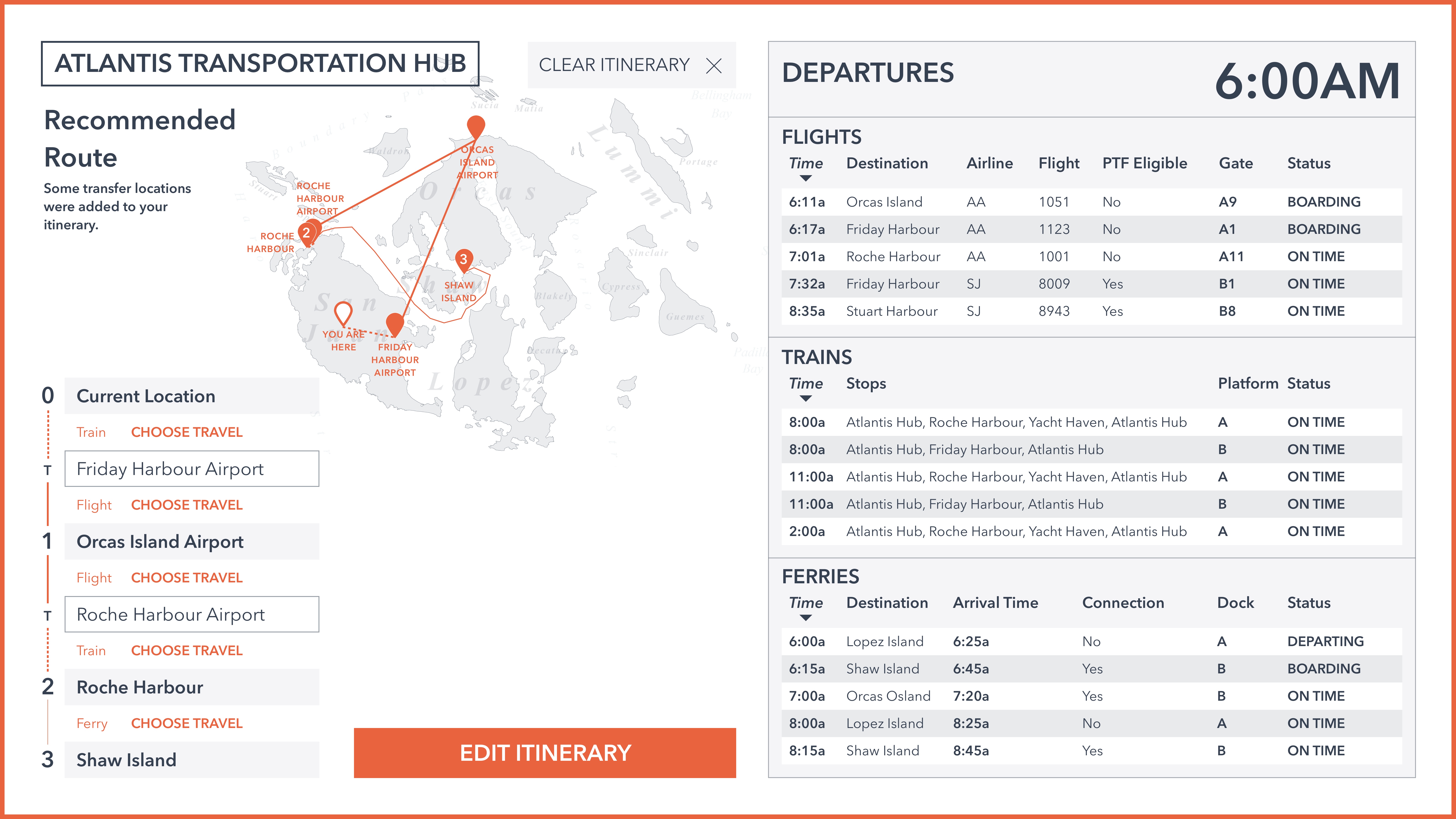
Recommended Itinerary Route
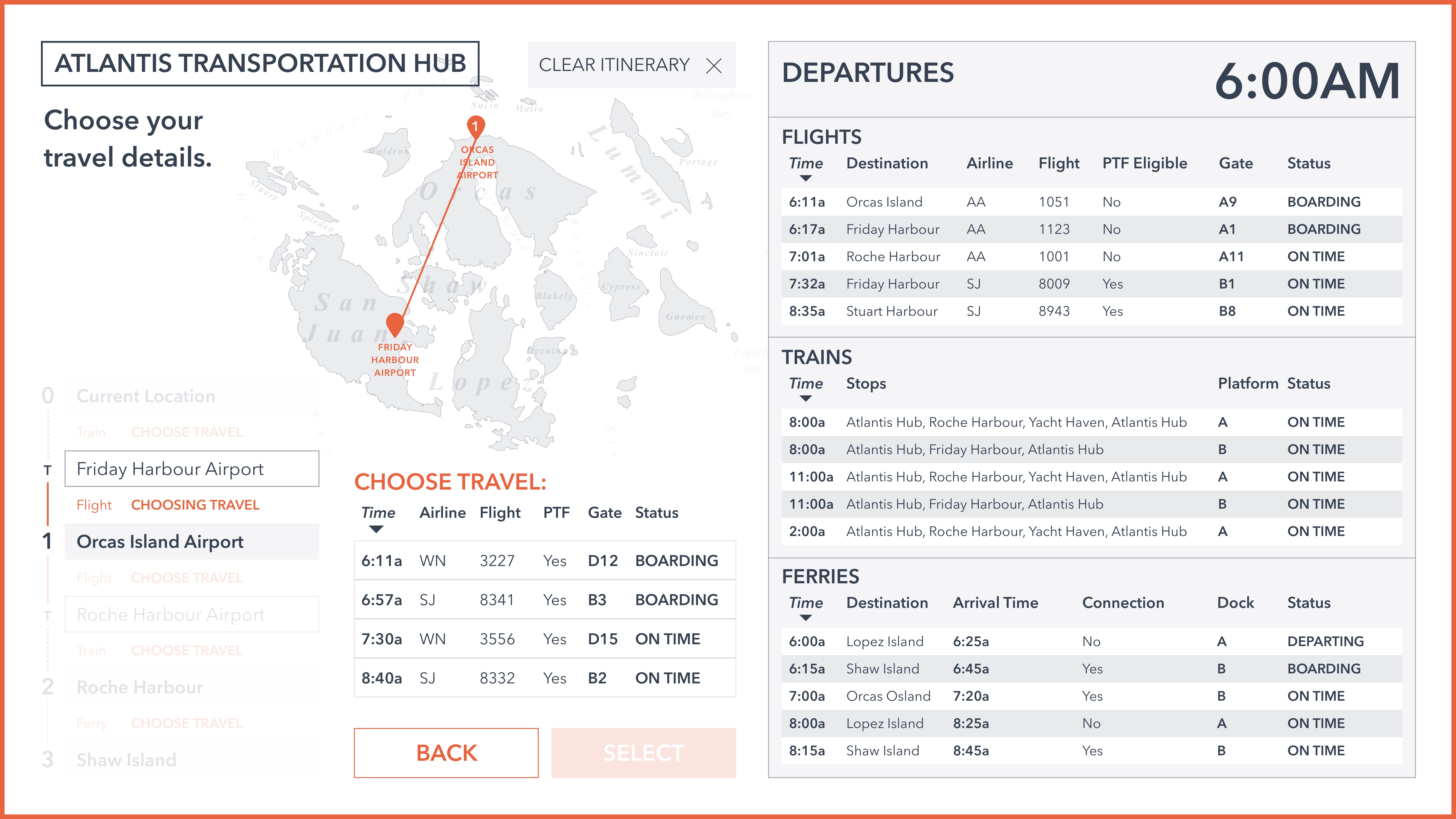
Choose Travel Details (options displayed)
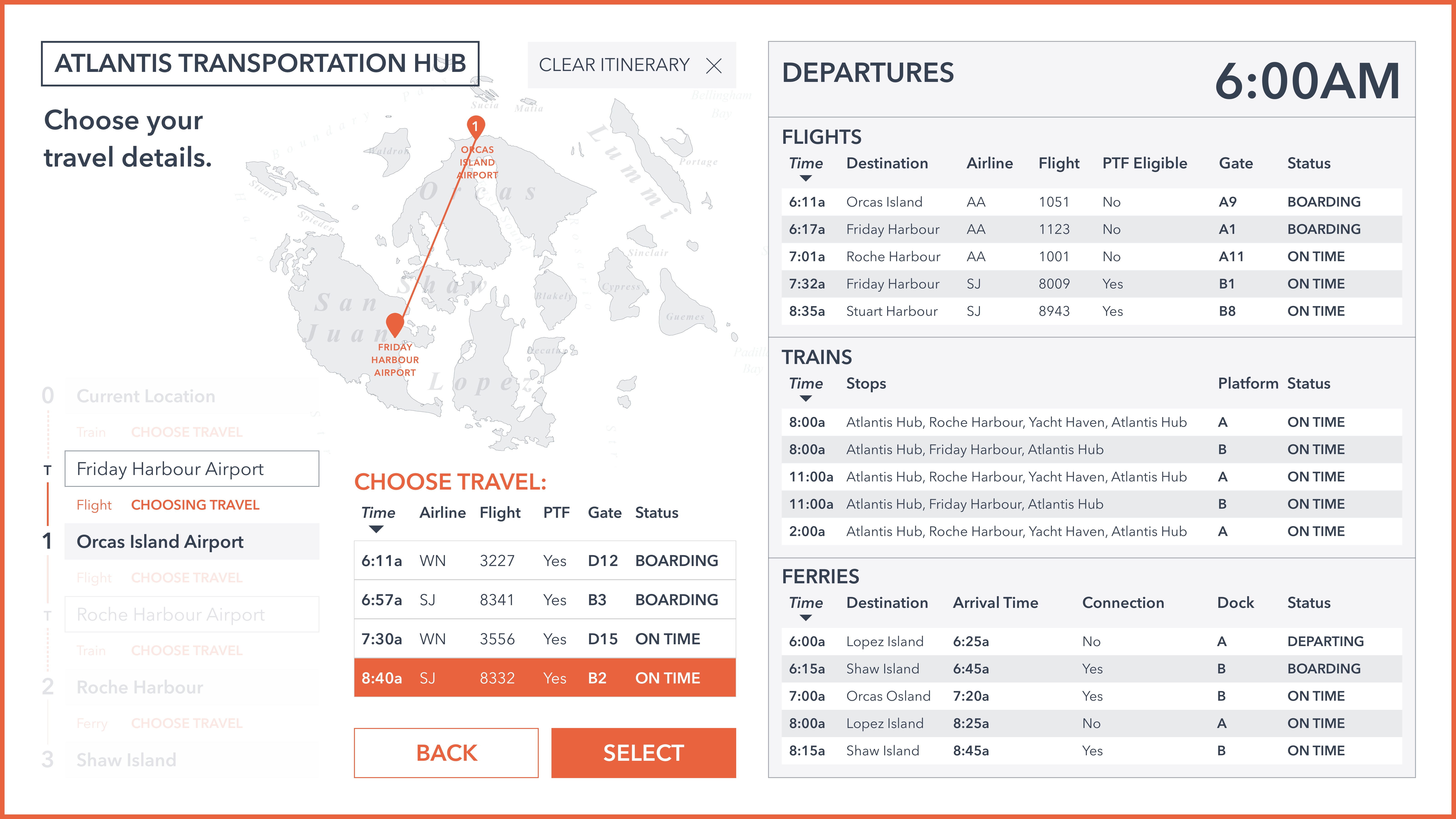
Choose Travel Details (choose one option)

Please view and confirm Itinerary
Print Itinerary

Itinerary is printing, NOT A TICKET
Final Mockup & Animation
For the final mockup, I chose to remove the Burnt Orange border around the screen to remove potential distractions and emphasize the white space around the page elements.
Invision Prototype & Animationhere.
Walkthrough

Select Destinations 1
Select Destinations 2
Select Destinations 3
Select Destinations 4

Select Destinations 5
Recommended Itinerary Route
Choose Travel Details (options displayed)
Choose Travel Details (choose one option)
Please view and confirm Itinerary
Print Itinerary
Itinerary is printing, NOT A TICKET
animation 1
Animation 1
When designing the animation between interactions, I chose to create a fade-in/appearing location marker for the destination that the user selects; when they touch the destination’s marker, they are able to immediately see the state change in which that location’s marker changes to an orange and increases scale. This results in a fluid and dynamic transition between pages.
animation 2
Animation 2
This animation serves as a fluid transition between the “Recommended Route” page and the “Choose Travel” page by visually linking which travel you are searching for.